mapping

Palladio: Humanities thinking about data visualization

palladio_logo

A guest post by Mark Braude, Postdoctoral Research Fellow / Project coordinator, Humanities + Design, Center for Spatial and Textual Analysis (CESTA), Stanford

An Overview of Palladio

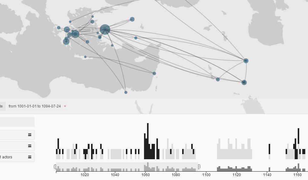
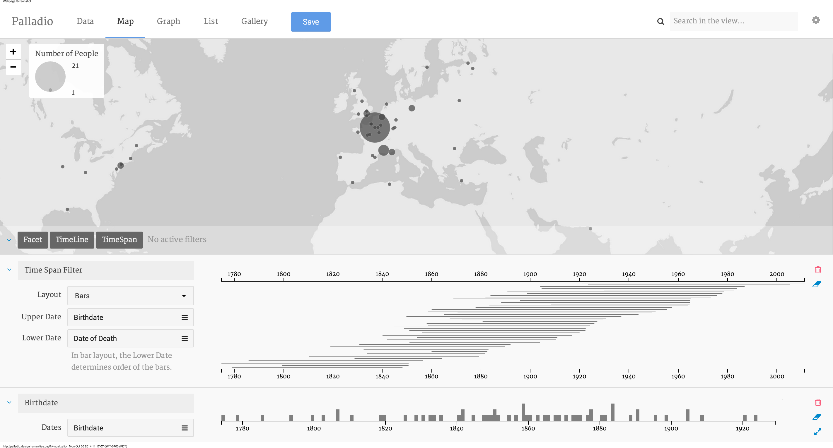
Palladio (palladio.designhumanities.org) is a web-based platform that allows any researcher to upload, visualize, and analyze complex and multi-dimensional data, directly in a web browser. The Palladio visualization system combines a primary view with filters to make it easy to query a data set. There is no need to create an account and nor do we store any data. Any work done in the browser can be saved and shared as a Palladio Project, which takes the form of a .json file.

Read More»

Topographic Unconsciousness

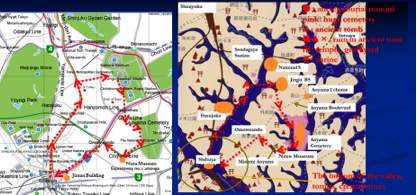
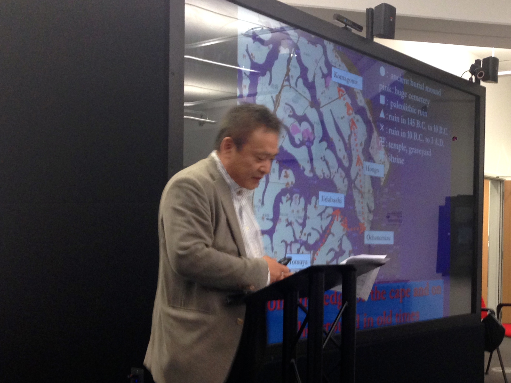
[This is a guest post by Akiyoshi Suzuki (Nagasaki University), with a summary of his Hestia@Birmingham presentation on the subject: ‘A Good Map is Worth a Thousand Words: 3-D Topographic Narrative of Haruki Murakami’]

The mapping of novels has been popular in Japan, either for simply providing a guide to fans wishing to follow the footsteps of the characters or else for bringing to the surface the unconscious, the blind spots or else the novel’s biopolitics. For readers of Murakami’s fiction, however, mapping is uncertain; the characters’ trails are strange and mysterious. And a constant refrain is heard, as when Naoko in Norwegian Wood asks, “Where are we?”.

Read More»

Reading Herodotus spatially in the undergraduate classroom, Part III

This is the third and last of three posts reporting on the deployment of the Hestia toolkit to teach Herodotus’ Histories in two college classrooms at The University of Texas at Austin. The previous post described the design of an upper-division research seminar, intended for Ancient History, Classics, and Classical Archaeology majors, that integrated Hestia resources with training in historiography and network visualization. This post explores how that course design worked in practice, discussing successes and failures from the perspectives of both students and instructor. It’s a long post, but the conclusions are summarized at the end, so the impatient reader can jump to the bottom.

Most teachers are aware of the gap between the ideal version of a class created during the design process and the way that class unfolds in practice over a semester. For most of us, the practical version includes dead ends, failed experiments, course corrections, and — if we’re lucky — some unexpected successes. In some cases, elements that we initially saw as core components of the class turn out to be less important than aspects that we treated as peripheral when we designed it. In other cases, canonical core material crowds out digressions we hoped to spend time exploring. In this class — officially titled “Watching the Barbarians: Herodotus, Ethnography, and Archaeology” — both of these things happened. This isn’t at all unusual. But what makes this a particular interesting case study is the way digital technologies interacted with the arc of the course.

Read More»
Reading Herodotus spatially in the undergraduate classroom, Part I

This is the first of three posts reporting on the deployment of the Hestia toolkit to teach Herodotus’ Histories in two college classrooms at the University of Texas at Austin (and to introduce the historian’s work to one high-school Latin class). This post focuses on the reaction of high-school and lower-division college students to the Hestia narrative timeline as a supplement to traditional instruction based on printed texts.

On June 6th, the Hestia2 project will hold the last of its four seminars: this one will focus on the use of digital tools in teaching and public engagement, and the connection of digital pedagogies with scholarly research. It therefore seems like an especially good time to discuss the results of a year-long experiment with the Hestia toolkit — primarily the narrative timemap, but also the ARK database — in one lower-division and one upper-division Classics course at The University of Texas at Austin.

Read More»

Beyond images and surfaces: Impressions from the ‘Telling stories with maps’ symposium in Birmingham

As we have already written on this blog, the fourth event within the Hestia 2 programme recently took place in Birmingham. With its focus on qualitative GIS and narrative mapping, this symposium was closest to my own academic interests and motivations for participating in the project. Its selection of papers, audience and topics achieved one of the long-standing aims of the Hestia team: to bring together the social sciences, humanities and the ‘IT crowd’ in a genuine interdisciplinary dialogue. Testifying to the success of the event were the high attendance rate, the diverse professional backgrounds of participants, and the numerous follow up discussions instigated on different fora (particularly twitter and the ‘blogosphere’).

Read More»

Hestia2@Birmingham 30 April 2014

This week sees the third workshop taking place as part of Hestia 2. The event is being hosted by the University of Birmingham’s Digital Humanities Hub, which seems appropriate as it is a facility dedicated to bringing together scholars and practitioners from across disciplines interested in different ways of visualising the world.

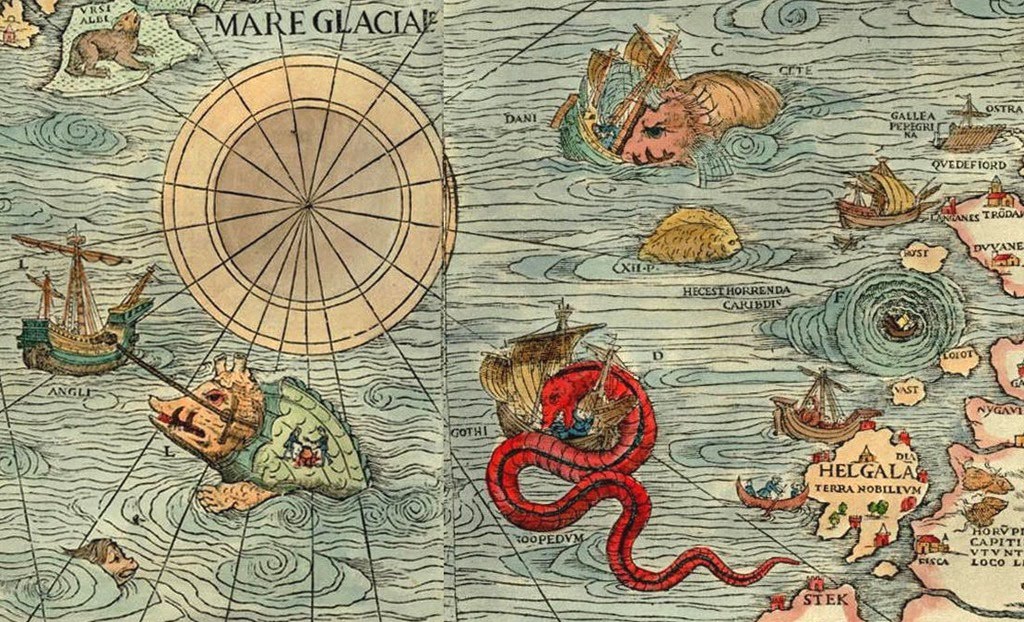
The theme of the workshop is qualitative GIS – techniques for exploring non-numerical data through mapping. This is a relatively new field, although not without important precedents. Historically, cartographers would add a range of images to their maps. These could range from drawings of mythical beasts animating far off lands to town plans complete with sketches of key buildings. These drawings went beyond cold, scientific representation to tell us something about the way places were imagined and lived. As Geographical Information Systems (GIS) were developed in the 1960s and 1970s they became a tool for representing numerical data, reflecting the fashion at the time for using computers to ask new, highly quantitative, research questions. In GIS, places are all-too-easily reduced to points, lines and polygons, all of which can have values attached to them. Conventionally these values were either numeric or comprised basic text strings, but as computers became more powerful in the 1980s, longer texts, photographs, audio and video could be added.

Read More»