Why Update ORBIS?
There’s a lot of digital humanities left to be done. There are books that haven’t been digitized that need to be mined to find trends to put on maps using algorithms that haven’t even been designed yet. So, when you consider that the significant effort necessary to put a new finish on a project like ORBIS, you might think it’s a waste of time. I know I get a bit uncomfortable about it when I consider the other projects that were proposed and which lost out on achieving some measure of implementation because of the support for a version 2 of ORBIS. It’s not a zero sum game that we have going in this field, but it does suffer from entrenchment and there are natural inducements to supporting existing, successful work that can foster a rich-get-richer climate.
And ORBIS has been successful, in ways that I never expected. It’s been remarkably popular, even after all this time, both in web traffic and attention on social media and forums. For a decidedly academic project that was designed, in the words of Walter Scheidel, “for an audience of 37 people”–his fellow scholars of Roman history who would appreciate this resource–it has proved to have much greater reach. That popularity, though, is more than just a gold star, it actually afforded us the capacity to understand more deeply how people used the site. By leveraging analytics, we could see just what people were doing, and frankly where we had failed in design and implementation. Popularity and success, then, are not just inducements to invest more, but also far more productive of feedback. The creation of interactive scholarly works like ORBIS is still so new and poorly understood that just having a solid understanding of how to do something better, based on actual feedback by a sizable audience rather than the intuitions of a few flaneurs, is reason enough to invest more time and effort in a project. I’ve been chided by scholars for my reference to the number of visitors that ORBIS receives, and I agree that there’s a risk that we might try to create works that are populist rather than academic, but if we’re going to try to measure impact, then I think it has to mean something more than citations in first-rate journals.
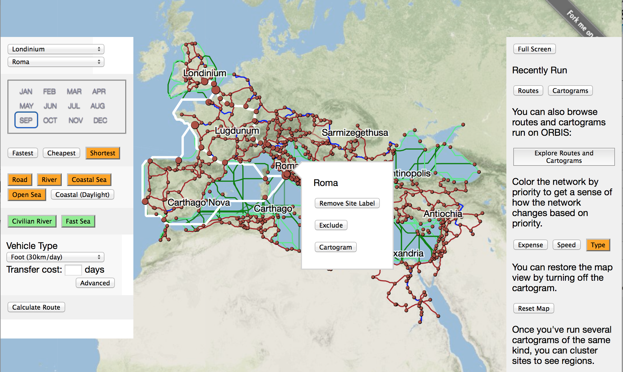
This is why there’s a greater emphasis in ORBIS v2 on design. The analytics for the site show that half the people who ever visit have never seen the interactive map. And only a third of those that did ever saw the dynamic distance cartogram. And only a tenth of those ever saw ORBIS|via. To be clear: it’s not that visitors didn’t use them, it’s that they never even saw them. This probably explains a few of the downvotes ORBIS gets whenever it shows up on Reddit–people go to the page and see nothing of the “interactive map of Rome” that they were promised. In contrast, in the case of the interactive map, usage rates and engagement were extremely high when people found the map, the same with |via, but the cartogram, even when people were exposed to it, was unintuitive and little used. Taking this all into account, the new version of ORBIS is being built in public, warts and all, incrementally, and with constant calls for comment. The interface itself is the map, and integrates the cartogram functionality (and eventually the |via functionality) directly, rather than in different tabs. All this is done by building the entire site and interface using d3.js, so that the interactive components and information visualization use the same code as the web map, an approach we took with Kindred Britain and found feasible. A rudimentary tutorial attempts to guide users through abstract and complex aspects of the site.
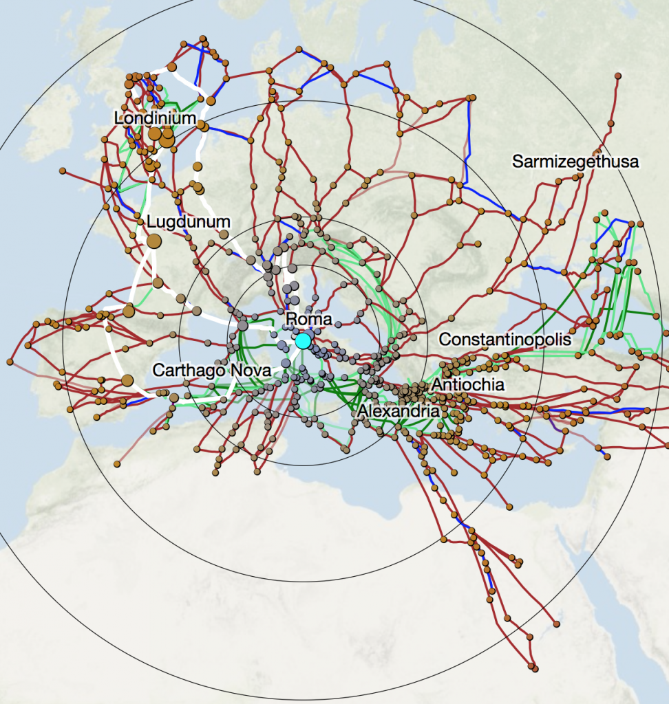
The new cartogram can be run from any site with any settings, and distorts the base routes as well as calculated routes.
But ORBIS wasn’t just successful as a Google Maps of the Roman Empire for role-players and strategy gamers and historical fiction enthusiasts. It’s also been used in research, both of the Roman world and as an integrated component into research on historical climate change. To improve ORBIS as a scholarly tool and citable work, we’ve improved the robustness of the presentation of routes and cartograms run on its model. We’re also enhancing the model by associating every site in ORBIS with its Pleiades record and expanding the network with roads from the AWMC. Eventually, we’ll provide the capacity to annotate collections of routes and cartograms, to better provide the capacity to compare different results and provide easy citation.
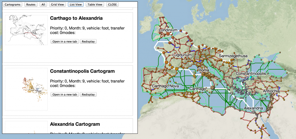
The cartograms and routes you’ve run are now displayed as a list, table or grid for easy review, and also provide static images of each
Finally, ORBIS has found its way into the classroom via a few different mechanisms. The use of interactive scholarship in pedagogy will only continue to increase, and so it’s critical that we build interactive scholarly works in such a way as to make them easily integrated into classrooms of all sizes and types. Our hope is to develop a presentation mode for ORBIS that draws from lessons learned in academic posters, on-line courses, and traditional conference presentations, to ensure that ORBIS can be integrated into a classroom environment as easily as possible.
When ORBIS v2 is finished in mid-2014, it will not be so radically different from its first incarnation, especially in regard to core functionality. Instead, it will be designed better, for its use by its original audience, to be sure, but also by the variety of audiences we didn’t realize might have interest in such a work. What’s most exciting about digital humanities scholarship like this is that these audiences don’t have competing needs, but rather that they all help to contribute to the improvement of a work like ORBIS for every reader. The capacity to create a work like this, that blurs the line between popular and academic scholarship, has always been one of the great strengths of ORBIS, and it should continue to be so with the new version.






You must be logged in to post a comment.